Logo
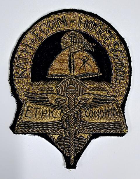
The first logo of the then Roomsch Katholieke Handelshoogeschool features a prominent Viking ship (with main and auxiliary sails) in the theme of trade. Norwegian sailing ships were used for trade and transportation and, occasionally, for less peaceful purposes. That a Norwegian type of ship was chosen probably relates to two saints—Radboud and Olof—whose names were used by the founders of Catholic higher education in the Netherlands.
The Saint Radboud Foundation was a club of dignitaries who worked for special Catholic higher education from the beginning of the last century. The crowning achievement of this work was the establishment in 1923 of the Roomsch Katholieke Universiteit te Nijmegen (since 2004 called Radboud University) Radboud was a convert, quite fitting for a company with missionary zeal. Saint Olof was also a convert and is the namesake of the first and oldest student association in Tilburg. This holy Norwegian lived around the year 1000 and converted to Christianity after initially participating in several Viking expeditions. The cross on the ship, as can also be seen on the Beadle's staff, refers to this. That there was consistency in naming during the first decades of Tilburg University's existence is finally evidenced by the name of rowing club Vidar, also named after a Norse god.


The logo in the crown of the beadle's staff (top left image)
After the arrival of new faculties in 1963, the logo became more abstract, giving way, in 1986, to a red triangle, with a number of lines decreasing in thickness underneath. The whole was meant to represent the dynamics of a young university that now went by the name Katholieke Universiteit Brabant. Neither name nor logo were long-lived because, in 2002, the name was changed again, this time to the Universiteit van Tilburg. This of course called for a new logo: the bright red and far-reaching abstraction gave way to a classic color combination and a number of highly recognizable elements. At the center is the tree, an ancient symbol of knowledge, which in this case also refers to the natural environment in which the university is located. Below the tree are two figures, one holding a book, the other a key. The book is a known symbol of wisdom, the key represents its accessibility.
At the presentation, it was denied that the logo would show Saints Peter and Paul, with key and book. It was stressed that the duo is in a circle of blue squares, referring to the "open, innovative community where the acquisition of knowledge is central, where people inspire each other, and where involvement with each other and with the society in which we are rooted is vital."
More about history and academic heritage
The Tilburg University academic heritage is a very diverse set of archives, visual materials, collections, devices, recorded stories, et cetera that relate to the history of the university.